
W.E.B. Du Bois was a renowned sociologist, historian, civil rights activist, a writer but not many people realize that he was also a data visualizer and an early pioneer of data viz activism.
Du Bois was given a booth at an exhibit in Paris in 1900 to demonstrate the progress made by African Americans since the Emancipation. This is where he showcased 60+ data visualizations alongside photographs of African Americans.
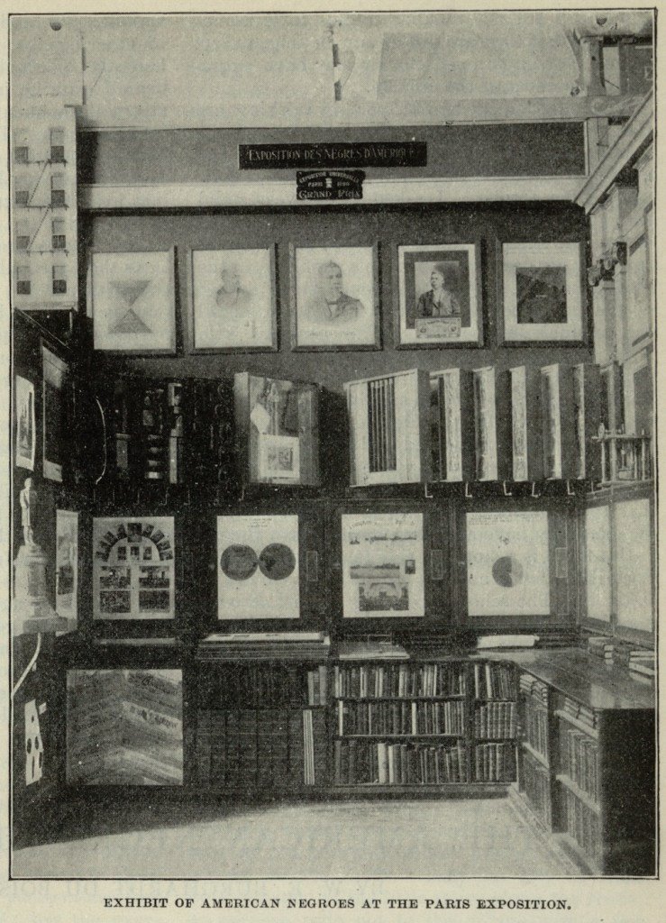
Many articles you find online will only mention the photographs he displayed and overlook the graphical evidence that accompanied them. The only resource I could find was this book W.E.B. Du Bois’s Data Portraits: Visualizing Black America that compiled all these 60+ visualizations.
Data Viz Activism
Many would argue that Du Bois’s work is one of the early examples of data viz activism (actually, people sometimes refer to this as “infographic activism” but I’ve renamed it to “data viz activism” to not confuse his work with a new form of infographic activism we see on social media now).
Data viz activism is when data visualizations are used to spread awareness about social issues and encourage people to act in a way that will lead to social change. The hope is that these visualizations are a product of properly conducted analyses and thorough research.
In a time of heightened misinformation, I highlight, underline, and bold this criterium to differentiate it from some of the hasty infographic activism we see spreading on social media created sometimes without strong supporting evidence.
Why did Du Bois and his team choose data visualizations as their media?
Du Bois recognized the potential of data visualizations to illustrate and highlight the stories in their data, and that’s what he and his team sought out to do in a short amount of time for the Paris Exhibit in 1900.
Du Bois’s goal with these visualizations was to refute prevailing racist beliefs of that time, which were often based on unsupported evidence. He used his rigorous statistical and analytical training to tackle these unfounded beliefs using eye-catching data visualizations.
But they wanted their visualization to live beyond journals and articles that only academics, specialists ones at that, would read. They wanted the masses to see and understand this.
What topics did their data visualizations cover?
Du Bois sought to address some of the prevailing racist beliefs of his time (remember, he was living through the Jim Crow era and residing in Georgia at that time), such as:
- African Americans are inferior in intellect, incapable of attaining material success.
- The African American population would decline and eventually lead to the extinction of this group.
He, however, believed that “The problem of the 20th century is the problem of the color line”, as opposed to some innate inferiority of African Americans.
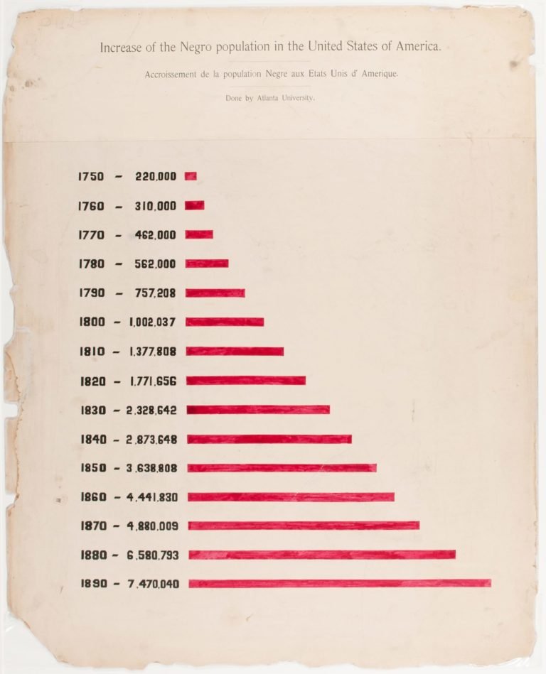
Some of Du Bois’s and his team’s visualizations used Georgia as an example, for several reasons:
- To add specificity to a national topic
- The state has a mix of both rural and urban communities
- They were located in Atlantia University
For instance, this one illustrated an increasing size of the African American population (to address the Black extinction theory):
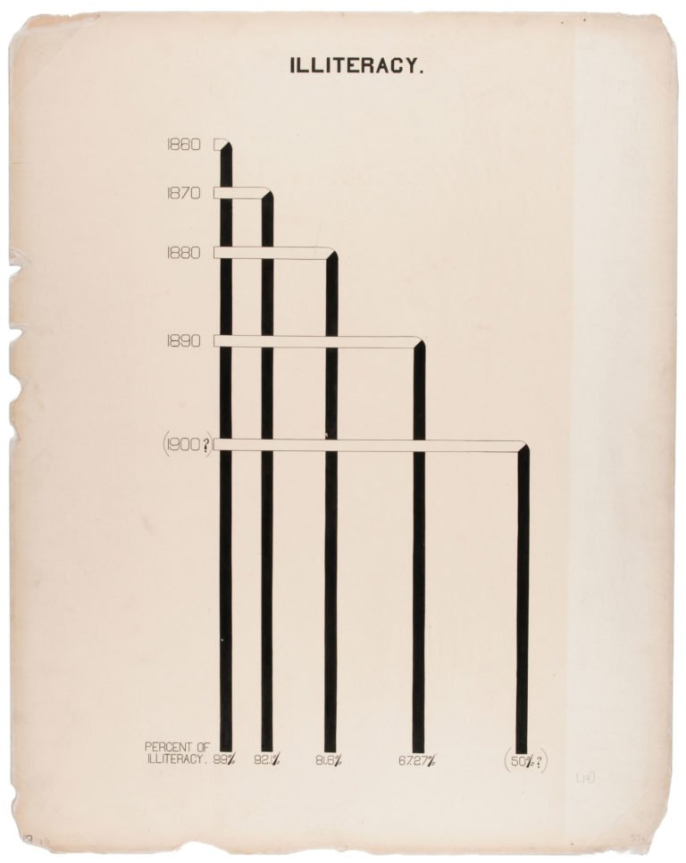
His team also found Black illiteracy rate declining, showing that Blacks are capable of being intellectually equal and superior:
He also found data suggesting an increase in material ownership and other indicators of success amongst African Americans:


In next week’s blog, I’ll examine some of the unique designs and data visualization techniques Du Bois and his team employed in some of these visualizations (like the one above!).