
Last week I introduced Du Bois’s and his team’s data visualizations that they prepared for an exhibit in Paris in 1900 (read more about it here).
This blog will examine and, more importantly, appreciate some of their unique data viz designs and techniques.
The Spiral Graph
Du Bois and his team created a spiral graph that was unique for their time to illustrate the progress African Americans had made in attaining material wealth over time.
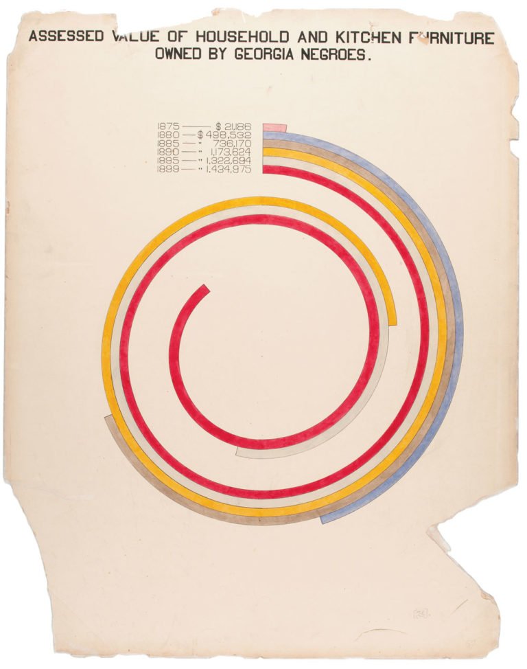
Here, I imagine the intent is not to focus on the exact values because of how difficult using a spiral graph to find the exact values would be (although they have annotated the exact values on the side for those who are interested).
The intent with this spiral graph is to show how a certain measure has been increasing over time. Such an effect (the spiral) could not have been achieved if the measure did not increase significantly (otherwise there would be no spiral, just a slightly curved bar?).
Here’s another variant of a spiral graph (although it’s also a mix of some other types):

Here, again, the spiral is sending a message that there is a large quantity of something –in this case, it’s showing that there are way more African Americans living in the country and villages than in cities.
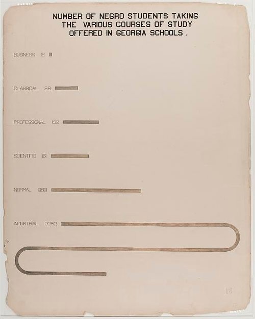
Overlapping Bar Chart
The overlapping bar chart is a similar variant to the spiral graph, which some also call a “serpentine chart” because of its shape.
Instead of having the bar chart continue straight on the axes, Du Bois or a member of his team decided to overlap the bar chart. The eyes are immediately drawn to the overlap, and the objective is achieved in highlighting the overlapping feature. In this case, the overlap is highlighting that industrial studies is the most common type of course African American students in Georgia are enrolled in.
If you liked these unique data viz designs, you may want to check out this project from a few years ago that aimed to visualize student debt using the same style employed by Du Bois and his team in this exhibit.