If you are a data visualizer, or anyone in the design field, it’s likely you’ve heard of the Gestalt Principles. These principles are a set of laws based on how humans group objects and identify patterns among them.
In this post, I’ll review just 3 of these Gestalt Principles for data visualization.
We’ll focus on how to apply these in your viz and how to avoid some common mistakes. Just knowing and implementing these principles can help you create more effective visualizations. Just note that the list of Gestalt Principles is longer than the few this post will discuss.
Similarity
Similarity is one of the more intuitive of these principles. Humans perceive objects that have the same visual properties, such as color and shape, as part of the same group. Sounds pretty obvious right?
As straightforward as this sounds, I’ve seen many people forget this and make visualizations that go against this principle. For instance, using the same shape (even though they may be colored differently) for different groups may cause some to assume those groups are related in some way. A similar effect can happen when using hues of the same shade on different groups.
Interestingly, I have also seen people avoid using this simple principle to their advantage. For instance, in a bar chart showing rankings of different categories, usually we want to highlight the top or bottom x features. Often I’ve seen people choose to color each category differently instead of using the same color to highlight this group.
Using the same color makes it clear that these elements belong in the same group.

Proximity
Elements that are close together in proximity lead people to believe they are similar. Often people who are using bar or pie charts are not trying to imply the slices close together are similar in any way. Usually the categories are positioned in some random order. For this reason, it may be best to order the elements in ascending or descending order by value, if possible. This will make it easier for your audience to compare the relative values for your categories.

But I specifically chose to include this principle in my post to caution about combining charts. (These are also known as combo charts or dual axis charts.)
Combo charts are usually easy to create in most visualization softwares and also very tempting to create (I mean two charts in one –what a deal!). There are many reasons why this type of chart is generally not a good idea to use.
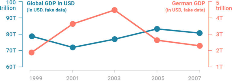
One of these reasons is related to the Gestalt Principle of proximity.
Combining two charts into one can cause your viewers to assume that elements that are closer together in proximity are similar in some way, regardless if they are from the same chart or not. And no, having two separate and clearly labeled axes for each chart won’t counteract this principle.
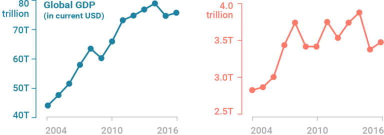
Instead of using combo charts, you can simply pull these charts into separate y-axis (you can use the same x-axis). Like below (source):
Enclosure or Common Area
A third principle I’ll cover is known as enclosure or common area. It’s one of my favorite ones because of how intuitive this principle is and how easy it is to add to your viz. It’s also very hard to get wrong (yet, we still manage to unintentionally abuse it).
It works like this: group elements that are similar into the same enclosure. It’s as simple as doing this:

Look how clearly the enclosure screams that these elements contained within the same enclosure are part of the same group.
Sure, you can use the same color to indicate the groupings instead. But using enclosures makes it so much more visually obvious and powerful than the similarity and proximity principles.
There are other Gestalt Principles for data visualization (such as common fate, connectedness, parallelism) and I encourage you to learn more about them.
Come back to check out next week’s blog that will look at W.E.B. Du Bois’s infographic activism.
In the meantime, sign up for our email list to get more data viz related content delivered straight to your inbox!