
How you design your visualizations and dashboards will vary depending on whether your analysis is exploratory or explanatory in nature. It’s important to know the differences between these two types because they serve different objectives.
Why bother knowing this? Because you risk your visualizations being irrelevant or misguided and that may even cost you your credibility along the way.
Exploratory vs Explanatory Visualizations: Definitions
First things first, what does it mean to be exploratory vs explanatory?
Exploratory analysis and visualizations involve digging through the data to, well, explore. It means you likely don’t have a specific goal in mind, other than to explore potential patterns or relationships. You may or may not already have a hypothesis or specific question to ask the data yet. And you may not even be sure about the value of the data for further analysis or research.
Explanatory analysis and visualizations usually come after the data has been explored and the purpose is usually to communicate the outcomes and insights from your exploration of the data.
Differences in Visualizations
So let’s see how the differences between exploratory and explanatory analyses manifest in their visualizations:
Exploratory
- Don’t use heavy annotations such arrows or explanatory texts, to encourage unbiased exploration and original thinking
- Have filters/filter actions in order to aid in digging through data and seeing from different perspectives
- Do not phrase titles as call to actions or explanatory insights
- Usually have more than one type of visualizations to view the same data from different perspectives
- Usually not used for data storytelling/presentations until the explanatory phase is complete
- Sharing is limited to internal teams/research groups and not published or presented to larger groups
Explanatory
- Use annotations and attributes (such as color and size) to focus the audience’s attention to a particular insight and/or to explain observations.
- Optionally, have some filters/filter actions
- Optimize titles to highlight insights or be a call to action
- Use for data storytelling/presentations
If you’ve enjoyed this article, subscribe to our mailing list to get notified about next week’s topic: how to optimize your data viz titles!
Updated 02/01/21:
Here are some examples of exploratory vs explanatory visualizations:
Exploratory Visualizations
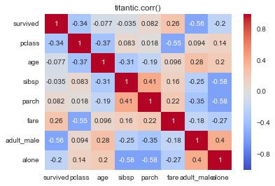
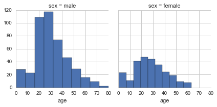
Here are some examples from some old scripts of mine where I was producing quick exploratory visualizations as I was doing some data analysis with the Titantic data set. I sometimes create several variations of plots in order to get multiple views of the data to understand it better.
Explanatory Visualizations
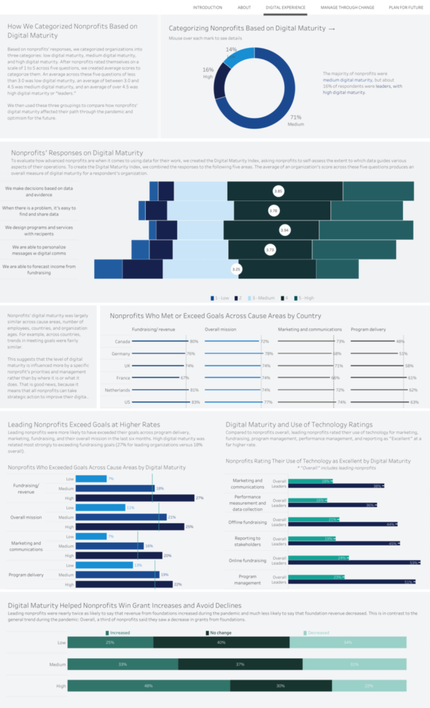
Here’s an example of explanatory visualizations by Salesforce (you can see the report here):
Notice how the author includes annotations and descriptions with the visualizations to explain the insights from their data.