3 reasons why you should follow data visualization color best practices
- Color influences where our attention goes and can be used as a powerful tool to focus your audience’s attention to exactly where you want it. Not being intentional and careful with your color choices will cost you this easy opportunity to control attention.
- Color often holds meaning or can make a certain impression. For instance, never use green to signify a loss in profit. And a hot pink viz doesn’t really scream professional.
- Not everyone can distinguish between different colors. Choosing the wrong color combos can render your viz inaccessible to people with colorblindness.
Less is More
I remember one of my college professors recommended not using highlighters while reading. She noticed that people end up highlighting almost everything. At the end, the page is full of highlights.
So did the highlighter serve its purpose or did it just add a lot more visual noise? Nothing stands out if everything is standing out.
Usually having 2-3 colors in a palette is enough to be effective. In the next section, I’ll guide you on how to select these few colors for your palette.
Just remember, you are not limited to 3 colors just because I said so. But starting off your viz with using few colors will help you be more deliberate and thoughtful in adding more colors to the viz as needed.
The highlighting color
A highlighting color will be used to draw your target audience’s attention towards an important part of your visualization. This color should stand out (but not like in a blinding, neon highlighter way).
Sometimes you’ll need to highlight two opposite trends like profit/loss. In such cases, you’ll need to have 2 highlighting colors. Just make sure these colors are colorblind friendly, like instead of green and red combo use blue and orange as I have done on the right.
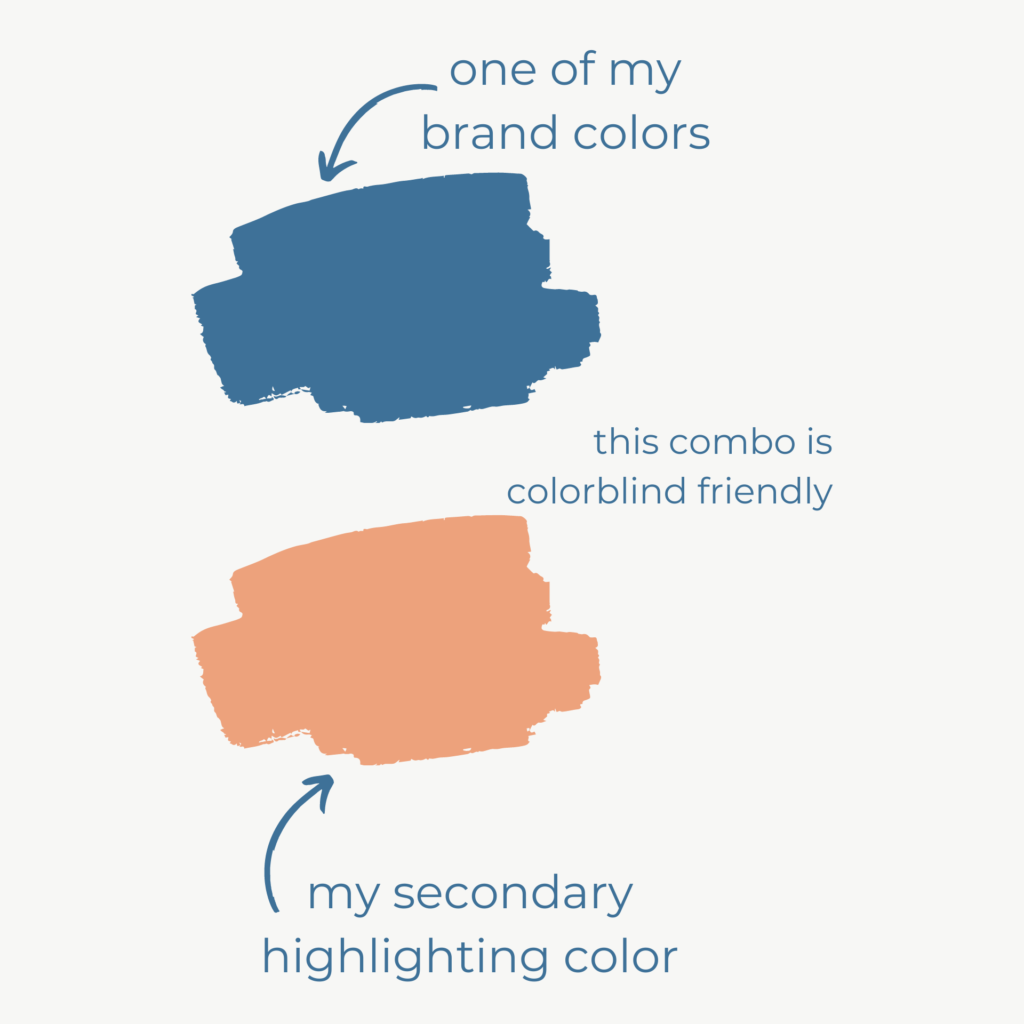
Brand colors can be incorporated into your palette depending on the color and what purpose they can best be used for.
Where to use your highlighting colors?
Think about where you want your target audience’s attention.
- What key point(s) do you want to emphasize?
- What questions or concerns will your audience have?
Find those parts of your visualizations that address these bullets and use the highlighting colors to focus your audience’s attention there.
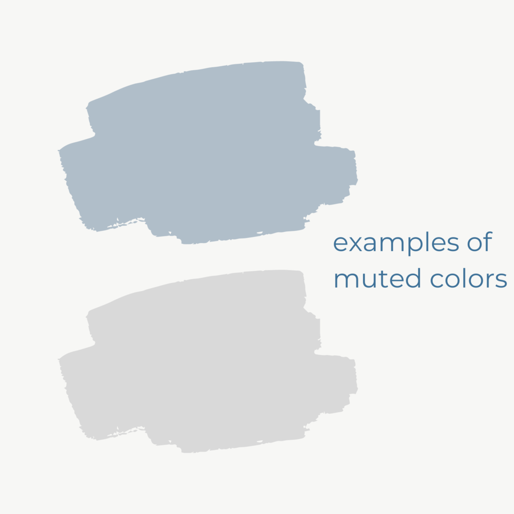
The muting color
In order for your highlighted color to work its magic, your visualization can NOT have other competing colors for the parts you want to de-emphasize.
You need to select a single muted color for the rest of your visualization that you want to stay in the background so that your audience’s attention can be directed elsewhere.
A shade of gray is the most popular choice for a muted color. Just remember to choose only one muted color or your audience will think the different shades hold some distinct meaning.
Where to use your muted color?
This is easy: use your muted colors for parts of your visualization that your are NOT highlighting. Don’t be tempted to use other colors for these parts. Otherwise, it will defeat the whole purpose of having highlighting colors in the first place.
Design with Colorblind in Mind
Colorblindness can affect 1 in every 12 men and 1 in every 200 women (source). So it’s important to create visualizations that will be accessible to people affected by colorblindness.
This is especially true when depicting profit/loss using the universally recognized combination of green and red respectively, which people with colorblindness are unable to distinguish between.
I recommend using an app, like Sim Daltonism or Color Oracle, on your computer to view how your visualizations will appear to people with colorblindness.
Below is an example of how the red and green chart on the left will be viewed by someone with protanopia, a type of red-green color confusion. The colors become indistinguishable and can cause confusion.
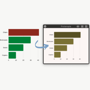

But the blue and orange combo, a popular colorblind-friendly alternative, can still be viewed as very distinct colors (as you can see in the right above).
Implementing these color best practices in your visualizations will make them more understandable for your audience. That way they’ll know where to focus their attention. And that is a huge feat in this world of distractions and short attention spans.
In next week’s blog, we’ll be talking about using filter actions to make your visualizations interactive and engaging for you and your audience. Subscribe to our mailing list to get notified when this blog gets posted.
Did you read last week’s blog on choosing the right chart? Read it here.