Anyone who has ever tried to make a chart using their data has hit a viz block. Nowadays, we have easy access to tools that can turn your tableinto any chart in a matter of click. But as a result, it’s common to feel overwhelmed by all the options when choosing the right data visualization.
It’s also easy to be tempted into choosing a chart that’s “wrong” for you data, or won’t do your data justice. The good news is there are often one or more right ones to use instead.
There are definitely many variations to the charts I’ll talk about and more unique alternatives that some softwares are able to offer. This post will cover the most popular and widely used charts that are pretty much standard across all visualization tools and how to choose the right one. As you get more advanced into your data viz journey, I encourage you to explore more on your own.
So, let’s get started!
Identify Your Objective: What are you trying to convey to your audience?
What are you trying to convey to your audience? Spend some time thinking about who you are creating this visualization for.
As I mentioned earlier, there could be more than one right way to visualize the data. Often, choosing the right data visualization will come down to what exactly you are trying to convey to your audience.
Although you can create an accurate and even a pretty chart without doing this step, you may end up failing to convey your actual message to your audience. And at the end of the day, that’s what ultimately matters.
Choosing the Right Data Visualization
Now comes the fun part of choosing the right visualization. Based on your objective and your data, choose the category that best fits both of these to see what options there are for charts.
Quantitative Data
Quantitative data are numerical data usually gathered by counting or measuring. Here are some commons visualizations for this type of data.
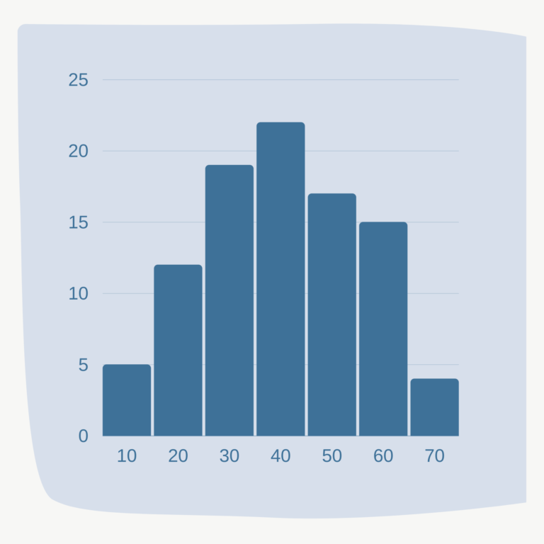
Histogram
A histogram is a common chart to use to visualize the distribution of your data. It’s similar to a bar chart but groups the numbers into bins.
Note that the shape of your histogram could change depending on how you bin your numbers, so watch out for that to avoid masking important distribution patterns!
Box and Whiskers Plot
In addition to visualizing the distribution of your quantitative data, you may also be interested in viewing descriptive statistics, such as the minimum, maximum, median and quartiles. A box and whiskers plot is a popular plot for visualizing these stats.
Categorical Data
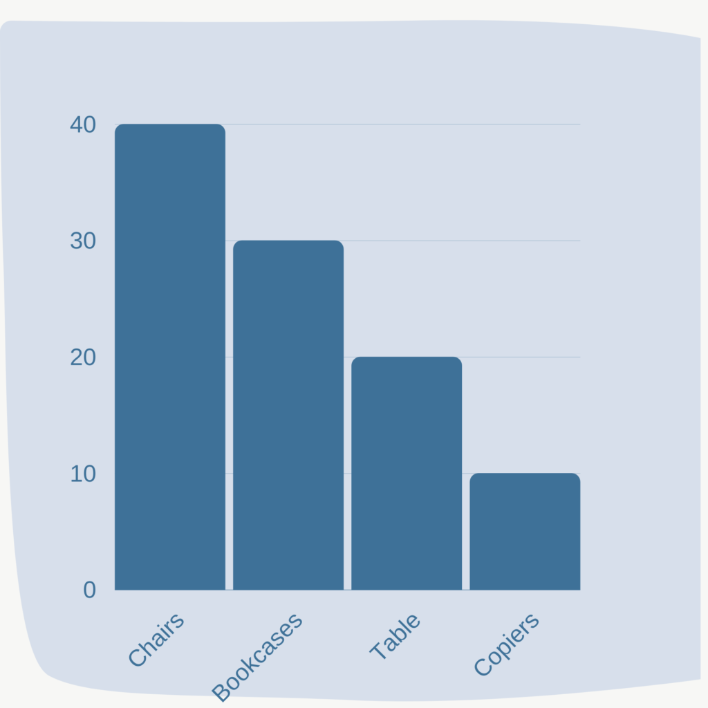
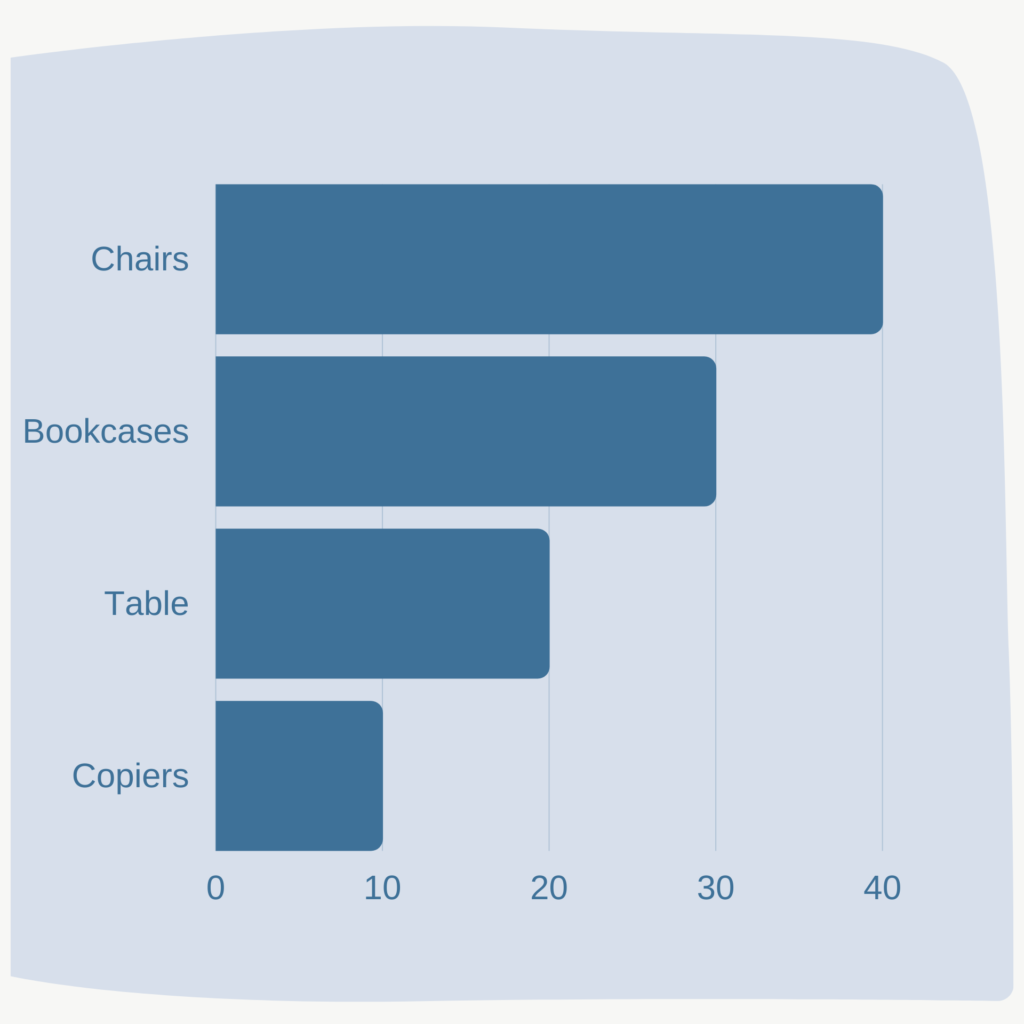
Bar Charts
The most common and easy way to show categorical data is through bar charts. While you could definitely use a vertical chart, try plotting using a horizontal bar chart. These tend to work really well for categorical data, especially if they have long names since it’s much easier to read when plotted horizontally.
With categorical data, you have some flexibility in ordering. For horizontal bar charts, I recommend to include the category you want to highlight at the top, as that’s where the eyes first go.
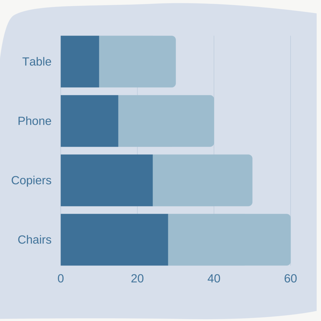
Stacked Charts
Stacked vertical or horizontal bar charts are the way to go to show subcomponents within each category.
But keep in mind, comparing subcomponents across categories becomes hard as you move away from the axis since the baselines are no longer consistent.
One trick to work around this is to convert absolute values to percentages so each component is a percent of the whole. This will make it easier to compare parts on either end of the bars since now both ends will have a consistent baseline.
Change Over Time
Line Charts
Line charts are probably what comes first to mind when thinking of visualizing data over time. They are an intuitive and easy way to show change over time.
Bar or Area Charts
Another alternative is to use bar and area charts. But our eyes tend to compare the top ends of the bar and area charts, so the filled area could be adding extra visual noise. I would highly recommend visualizing your data with a line chart as well to see which one best demonstrates the objective you are trying to convey.
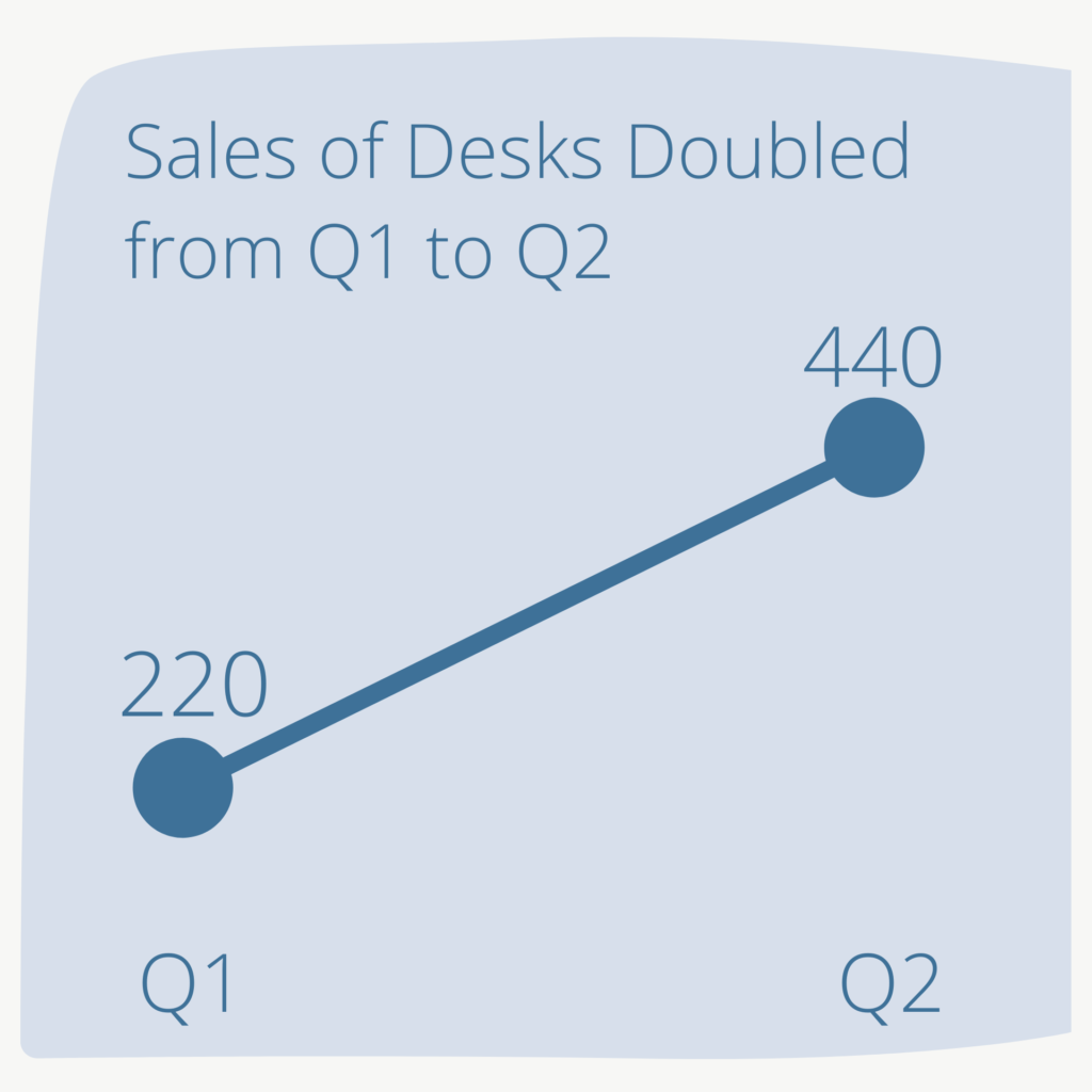
Slopeographs
If you haven’t used this graph before, I highly encourage you to try it out if you are comparing two time periods. These graphs do a great job of highlighting significant changes (increase or decrease) between time periods, and illustrate where things have not changed at much or at all.
If a slopeograph looks a bit underwhelming to you, you can use a bar chart instead.
Relationships
Scatterplots
One of the most popularly visualized relationships is correlation and equally popular is the scatter plot. This is the most common and effective choice for visualizing this type of relationship between 2 quantitative variables.
Scatterplots can visually illustrate both the direction and strength of the relationship. This information can also be derived from the correlation coefficient, but the scatterplot gives the added benefit of also showing the distribution of the data points, which the coefficient masks.
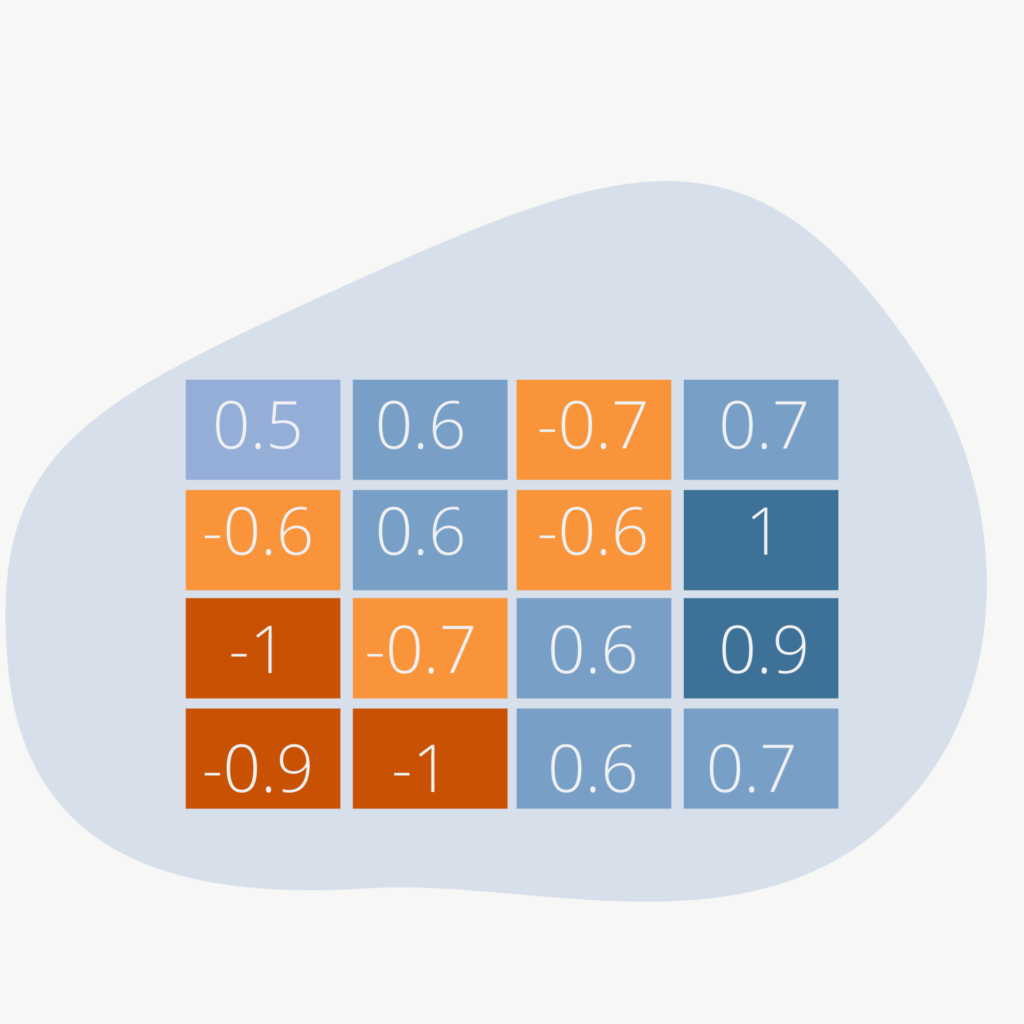
Heat Map Tables
The most effective part of a heat map is the use of colors to serve as visual cues for positive and negative correlations. This makes it easier for our eyes to distinguish information in a table.
If the table had contained just the correlation values without colors, our eyes would not have been able to easily see where there are strong or weak correlations.
Keeping it Simple
A chart may not always be the best option. Sometimes, the simpler options will not only suffice but can also be the most effective for your purpose.
Just Show the Number
If you want your target audience to focus on one number (or two), creating a chart to display that number can make that number stand out less. In such cases, displaying the number itself can actually be more effective.
Just Show All the Data in a Table
Sometimes it’s necessary to show all the data in a table. Review your table to see if you can help reduce the mental load for your audience when they try to process all the data on the table.
For instance, you can use highlighting colors to draw their attention to certain values on the table.
Use the workbook at the end of this guide to start picking and creating the visualizations that’s right for your objective and target audience.
Let’s move on to the next section where we learn about best practices for choosing colors for your visualizations.
Be Careful with These Charts
3D Charts
3D charts are not recommended because of the distortion associated with displaying 3D objects in a 2D space. As you can see from the right, it can be hard to identify the exact value for each bar chart because of the extra and unnecessary dimension.
Rarely does the 3rd dimension display useful information.
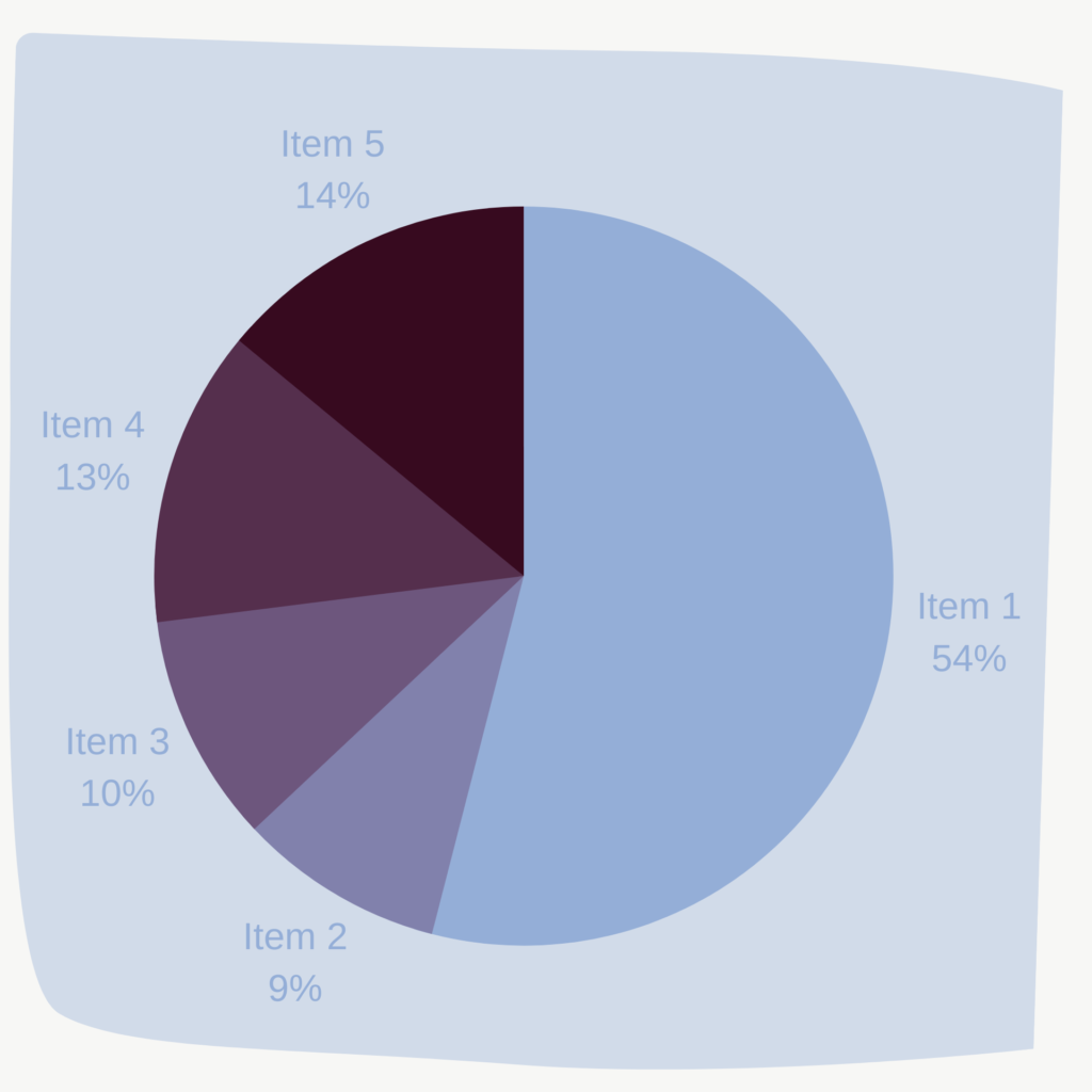
Pie and Donut Charts
It can sometimes be difficult to visually compare some of the slices of pie and donut charts, like the one right here.
Essentially, these slices are varying not by area but by angle, which our eyes are not very good at comparing.
In some cases, these charts are fine to use if they are comparing 2 to 3 categories max. Even then, I would recommend to first try using other charts, like a bar chart, as one of those will likely work better.
As I mentioned earlier, these are just a few chart types that you can choose from. If you’re interested in exploring other chart types, check out these sites that I use:
If you’ve benefited from this article, subscribe to our mailing list below so you get notified about next week’s topic: how to choose and use colors effectively in your data visualization
This website uses cookies to improve your experience. We'll assume you're ok with this, but you can opt-out if you wish. Cookie settingsACCEPT
Privacy & Cookies Policy
Privacy Overview
This website uses cookies to improve your experience while you navigate through the website. Out of these cookies, the cookies that are categorized as necessary are stored on your browser as they are essential for the working of basic functionalities of the website. We also use third-party cookies that help us analyze and understand how you use this website. These cookies will be stored in your browser only with your consent. You also have the option to opt-out of these cookies. But opting out of some of these cookies may have an effect on your browsing experience.
Necessary cookies are absolutely essential for the website to function properly. This category only includes cookies that ensures basic functionalities and security features of the website. These cookies do not store any personal information.
Any cookies that may not be particularly necessary for the website to function and is used specifically to collect user personal data via analytics, ads, other embedded contents are termed as non-necessary cookies. It is mandatory to procure user consent prior to running these cookies on your website.